
So, suppose you want to learn more beautiful writing. Now what? Do you take several calligraphy courses, or simply practice with a font? Are you buying a fountain pen or a dip pen? Is the new hobby worthy of your investment? This and more in the head-to-head comparison…
Why even learn calligraphy?
We need to have a fast, beautiful and hard to duplicate signature when we write the whole name rather than initials. Yet this does not justify further investment. Even worse, if you are overly invested in how you and your signature look, the graphological examination will show that you are a narcissist.
Brick-and-mortar shop owners may want to put on their products beautiful signs. Restaurant owners may want to draft a beautiful daily offer. PR people can try adding a personal touch writing to their clients. Graphical designers may want to try a special way of writing a title. These are all legitimate but very specific goals.
For me, the main goal to do that is simply the fun of it. There is something very clean and crispy in well-written text. It is not as effort-intensive as most other fine motoric practices and can easily be performed in a conference room while doodling. Diaries and notes written better will be more pleasant to revisit, and you may not be able to carry a laptop everywhere. Birthday and special occasion letters will look better….
You can learn calligraphy for fun or for business. The tools you use will differ…
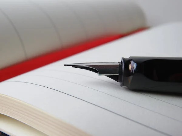
Fountain pens are limited
The fountain pens are beautiful, expensive, and limited. The fountain pen has a complex system of ink reservoir, feed, and nib. The body is made of precious resins with a touch of jewelry. The nib is often made of gold and meant to last for a century. All parts of the pen are balanced to work together perfectly, to go safely into your pocket, and to look smashing in your hand. It is the pen to sign a big contract or your book.
All this perfection is expensive, and also not fully flexible. A good gold nib system will cost you above 100 dollars for a single nib width. The feed will be fine-tuned for wet or dry ink. The nib itself will probably be very fine almost needle-like for annotations, medium – round and silky smooth for signature, or italian stub for some titles and calligraphic scripts. Even the gold nib is not very flexible and built so you can write at any angle. You will be discouraged to change the nib, or change the ink you use with each pen.
Dip pens are messy
Dip pens use disposable nibs. These cheap huge flexible nibs have a small ink reservoir in the middle of the nib, and the nib needs to be dipped accordingly. After each sentence on average.
The inks for the dip pens are in a different viscosity than the fountain pen inks, so they stay better on the nib. With dip pens, you can use colors that will probably clog your delicate fountain pen feeds. For example, you can use invisible and fluorescent inks, inks with metal particles and inks that are water-resistant, even shimmering inks.
Your dip pen nibs are disposable. They may rust and snap, and they are built for writing from a special angle. The nib holders are also very large and conspicuous: feathers, strange oblique holders… Each nib holder is intended for use with many nibs.
Working with dip pens is like working with brushes. It is messy. The inks may splatter. The nibs may bounce or break. The brushes are long. Replacing the nibs and rinsing the tools will probably stain your hands unless you work in rubber gloves. This requires a lot of space for your arts and expensive paper.
In-between
There are some calligraphy tools that are neither dip nor fountain pens. For example, brush pens or pilot “parallel” products line. They can be used for very specific business needs, like writing small signs for a small business, for expressive “modern” fonts or for comfortable calligraphy when you cannot handle the mess. Many beginners choose to practice specifically with those tools.
You can even improvise, for example connecting two pencils side by side, thus getting an equivalent of a wide parallel nib without any ink flow or nib flexibility. Just to get the shape of the tricky fonts right.
Dip pen fonts
With a dip pen, you can basically do any font. Italic fonts are probably the popular choice, and serious penmen also learn blackletter scripts. The nibs for italics often have very cool shapes that provide controllable flexibility, and are between 1 and 2 mm wide. The blackletter nibs look boring, and wide, often between 3 and 6 mm.
Probably very few people will use more than three italics and two blackletter script families. Calligraphers often have exceptional repeatability. All of their letters will look the same, like if they were printed. The lines will be straight even without ruling. This definitely requires a lot of repetition and a lot of practice. Beginners will usually use a ruler and measure everything, or use dotted paper.
In any case, you need to practice each font a lot to get good repeatability. Typically this includes copying quotes. And after repeating the quotes for a while, you are likely to remember them. That will make you wiser in the eyes of your friends.
Modern fonts
With your fountain pen, you will probably do modern fonts. The flexibility of the nib and line variation is very limited. This results in families of fonts, with little line variations. Most of these fonts will be modern fonts, as older fonts were developed for flexible nibs.
You can use cursive, printed letters, or a hybrid script. Also, you may add some beautification to the letters, like small serifs on some letters and picturesque title letters.
Modern scripts are often very expressive. Not all letters need to have the same slant or size, and you can choose between very angular and very rounded letters.
People writing with fountain pens are typically not professionals, and there is a large variability between the letters. Moreover, a large number of modern fonts can be practiced, as each font does not require a level of perfection usually expected from italics and blackletter fonts.
Doodling
Most manga drawing sets are for dip pens. The best manga nibs are very flexible and somewhat “scratchy”. This is not something loved by fountain pen owners. Of course, many professionals doodle and draw sketches with fountain pens instead. Personal skill matters much more than the specific tool used.
The ultimate and most famous manga nib is the G nib. The most flexible among manga nibs, the G nib creates fine to bold lines depending on the amount of pressure applied. The flexibility requires a lot of control and is more suited for advanced artists.
The spoon nib with its spoon-like shape is used by beginners and makes a consistent line width easier, producing thick lines on its side. It is not flexible. The consistent line width makes drawing flat and expressionless.
The school nib is fine slightly flexible and somewhat similar to what you get from a fountain pen. It is often used for cars and architecture.
Japanese nib is more maneuverable than other nibs, specially tuned for curves and hooks of Japanese script. It is a good overall compromise.
The maru/mapping nib is ultra-fine and small, often requiring a different holder. It is good for small details, especially of the female body.
Practice
Fountain pens can be used for practice. They are less messy, and they can do a lot of the work the dip pens can do. Lamy pens can be easily swapped with italic nibs. Kaweco has series with multiple italic nisbs. There are also specialized fountain pens with flexible nibs. A pilot parallel pen can handle the blackletter scripts.
You will not see oblique fountain pens and oblique holders are very useful for italics calligraphy. So what? The fountain pen nib is very agile can be used at the angles dip pen nib cannot handle well.
The opposite training will also work. You may enjoy more special calligraphic experiences with a dip pen. This is a very special experience: retro and refined. The actual fonts will be very much the same when you use a fountain pen in the conference room instead. Your fine motor skills and handwriting with a fountain pen are also likely to improve.
Mix
In your diary or in your sketches you may mix dip pen and fountain pen segments. The fountain pen will be easier to use, and you may use it all the time with both hands. The dip pen is more complex, and you are likely to use it with your dominant hand for titles and very specific drawings, or on weekends.
Maybe you will use your dip pen only when you do not have the right ink for the fountain pen, for example with sheening and shimmering inks. Or when you want a very special nib, like G manga nib or blue pumkin nib for italics.